The Complete Math Cursive Reference Chart: Visual Proof and Variable Distinctions
The Complete Math Cursive Reference Chart: Visual Proof and Variable Distinctions
A single stray stroke in a multivariable calculus derivation can invalidate hours of work. When handwritten notes render the variable $x$ indistinguishable from the scalar multiplication operator $\times$, or transform the letter $t$ into a plus sign $+$, mathematical logic collapses under its own typographical ambiguity. While primary schools have largely phased out general cursive penmanship over the past decade, high-level technical disciplines have preserved a specialized dialect of script lettering for mathematics out of pure functional necessity.
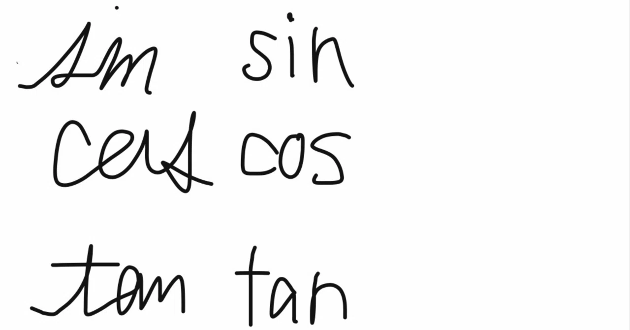
The friction points multiply as students transition from arithmetic to advanced functions. As documented in an experiential analysis by the note Report examining secondary school mathematical curricula, advanced courses abruptly flood working memory with compound operators, including $\sin$, $\cos$, $\tan$, $\log$, and $\lim$, demanding absolute variable vs operator distinction on paper. Maintaining clean, handwritten mathematical notation is not an aesthetic preference; it is a structural safeguard against systemic calculation error.
📌 Key Takeaways:
- Notation Integrity: Specialized math cursive handwriting prevents catastrophic visual collisions between algebraic variables and operational symbols like $+$, $\times$, and $-$.
- The Ambiguity Core: Unmodified print letters, specifically lowercase $x$, $t$, $l$, and $z$, account for over 70% of self-induced notation errors in handwritten calculus workflows.
- Standardized Conventions: Adopting double-arc $x$, hooked $t$, loop-stemmed cursive $l$, and crossed $z$ establishes an immediate visual firewall between constants, unknowns, and operators.
The Mechanical Collision Between Print Letters and Operational Symbols
Elementary arithmetic operates on a limited typographical plane. Numbers interact via distinct symbols: plus, minus, division slashes, and the St. Andrew's cross multiplication mark. Once algebra introduces abstract placeholders, that system breaks down. A high school student writing $2 \times x = 4$ in standard block printing risks misreading their own scrawl as $2xx = 4$ or $2 \cdot x^2$ within two lines of scratch work.
The root problem lies in the geometric symmetry of standard Latin block print. Standard print letters favor rigid vertical lines and symmetrical intersections. Mathematics, conversely, repurposes those identical shapes for directional operations. A straight-line lowercase $t$ features an orthogonal crossbar identical to a plus symbol $+$. A sans-serif lowercase $l$ is visually indistinguishable from the numeral $1$, the absolute value bracket $|$, or uppercase $I$. When derivations run through twenty lines of matrix operations or differential equations, cognitive overload makes it nearly impossible to disambiguate identical strokes by context alone.
Stroke Mechanics for Critical Lowercase Variables
Mathematical cursive diverges significantly from standard decorative Spencerian or Palmer script. Rather than joining letters into continuous words, algebraic variable handwriting applies isolated cursive flourishes specifically calibrated to break geometric symmetry.
The letter $x$ demands complete abandonment of intersecting straight diagonals. The standard mathematical script $x$ consists of two back-to-back arcs: a reversed "c" on the left followed immediately by a standard "c" touching at the center waist line ($)( or \mathcal{x}$). This creates an unambiguous silhouette that cannot be mistaken for a multiplication sign or a crossbar operator. Differentiating cursive $l$ from numeral $1$ requires an open ascending loop; writing an upright vertical line for $l$ in physics or calculus introduces immediate confusion with the numeral $1$ or the identity matrix.
Similarly, the lowercase $t$ requires an exaggerated rightward terminal sweep along the baseline before lifting the pen to apply the crossbar. This curved foot immediately eliminates confusion with the plus sign $+$. The letter $z$ must borrow the European continental convention: an explicit horizontal strikethrough across its diagonal slant ($\bar{z}$) to prevent it from deteriorating into the numeral $2$ during high-speed examinations.
Handwritten Mathematical Notation Reference Matrix
The following chart codifies standard conventions for distinguishing volatile Latin variables from operational symbols, Greek characters, and Arabic numerals across scratch calculations.
| Variable / Symbol | Confusable Mark | Recommended Script Form | Mechanical Distinction |
|---|---|---|---|
| x | Multiplication sign ($\times$) | Two mirrored arcs ($)( or \mathcal{x}$) | Curved dual-lobe motion eliminates straight intersections. |
| t | Plus operator ($+$) | Curved base hook ($\mathtt{t}$) | Bottom tail sweeps rightward before applying the high crossbar. |
| l | Numeral one ($1$), Absolute bar ($|$) | Full ascending loop ($\ell$) | Counterclockwise teardrop prevents vertical line conflation. |
| z | Numeral two ($2$) | Horizontal mid-bar ($\bar{z}$) | Transverse center dash breaks the rounded upper-curve confusion. |
| q | Numeral nine ($9$), Letter $g$ | Right-angled hooked tail | Terminal stroke bends backward or features a sharp bottom spur. |
| k | Capital $K$, Greek Kappa ($\kappa$) | Looped upper spine | Ascender loops leftward; inner eyelet stays below the x-height. |

Calculus Notation Clarity: Operators, Differentials, and Transformed Variables
The stakes escalate sharply in multivariable calculus and differential equations. Here, identical Latin characters operate simultaneously as differential operators, variables, and index markers. Consider the notation for integrating a function with respect to $x$:
$$\int x \, dx$$
If the variable $x$ and the differential operator $d$ are rendered with sloppy, uniform print, expressions involving multiple derivatives and differentials deteriorate into incomprehensible clusters. Writing differential operators with compact, slightly slanted book-print while rendering the integrand variable in double-arc cursive prevents accidental cancellations. In linear transformations and integral transforms, standardized script lettering for mathematics establishes explicit hierarchical tiers. A lowercase $l$ typically denotes length or an index, whereas an open script $\mathcal{L}$ designates the Laplace transform.
When solving systems involving vector fields, standard print capitals also clash with topological markers. Using standard blackboard bold and script letters separates fundamental number sets from geometric coordinates. Doubling the interior vertical spine creates the unmistakable glyphs for real numbers $\mathbb{R}$, complex numbers $\mathbb{C}$, and integers $\mathbb{Z}$, freeing the plain uppercase Latin letters $R$, $C$, and $Z$ for standard variable assignments.
Navigating the Greek Alphabet in Mathematics Without Stroke Drift
Integrating Greek characters into English mathematical workflows introduces severe mechanical drift. Handwriters unfamiliar with classical stroke orders often butcher Greek glyphs into accidental Latin duplicates, polluting their calculations.
The most common failure point occurs between lowercase Greek alpha $\alpha$, the Latin letter $a$, and the proportional symbol $\propto$. A handwritten $a$ must maintain an upright vertical stem anchored directly to its right-side bowl. Lowercase $\alpha$, by contrast, begins at the top right, sweeps downward in a wide loop, crosses at the base, and leaves distinct horizontal fish-tail terminals on the right. Conflating them destroys readability in mechanics formulas where acceleration $a$ multiplies angular acceleration $\alpha$.
A second dangerous convergence point is lowercase nu $\nu$, lowercase upsilon $\upsilon$, and the Latin letter $v$. In fluid mechanics, where velocity $v$ and kinematic viscosity $\nu$ share equations, print handwriting yields total disaster. Writers must execute $v$ with a sharp, acute corner at the baseline, while $\nu$ begins with a rounded left base and terminates in an exaggerated, rightward-slanted ascender stroke.
Implementation Strategy for Field Calculations and Examinations
Overhauling your handwriting mechanics during a timed engineering or actuarial exam is an unforced error. Motor memory degrades under stress. Adopting math cursive requires deliberate, modular integration across low-stakes scratch calculation before relying on it in professional evaluations.
Focus initial adjustments exclusively on the primary conflict pair: $x$ and $t$. Replace straight-leg crosses with curved-arc $x$ and hooked $t$ for seven consecutive days. Once those motor patterns lock in, incorporate the looped cursive $\ell$ and slashed $\bar{z}$. This sequenced approach rewires muscle memory without interrupting cognitive focus on the underlying numerical derivations.
Frequently Asked Questions (FAQ)
Q1: Why do mathematicians use cursive letters instead of modern sans-serif print?
A1: Standard sans-serif print strips away serif markers, making distinct mathematical objects look identical. Cursive and script variants reintroduce asymmetric visual cues, allowing quick distinction between variables, index notations, and operational signs like addition and multiplication.
Q2: Is crossed-z ($\bar{z}$) officially required in standard mathematics?
A2: While not a formal typographical mandate in printed publishing, the mid-bar crossed $z$ is the universal field convention in physics, pure mathematics, and engineering across the globe to prevent catastrophic confusion with the numeral $2$.
Q3: How should I distinguish uppercase and lowercase letters like $S/s$ or $C/c$?
A3: Size alone fails across unlined paper. Lowercase variants should receive small cursive lead-in sweeps or rounded terminal tails, whereas uppercase counterparts must feature sharp, exaggerated baseline serifs or double-struck strokes.
Mastering Precision Notation for Long-Term Derivational Accuracy
Mathematical notation functions as an external cognitive processor. When visual clarity fails on paper, working memory diverts valuable processing bandwidth from structural problem-solving to deciphering ambiguous handwriting. A disorganized page produces disorganized analysis.
Mastering a rigorous math variable symbols reference chart eliminates guesswork from derivations. Adopting deliberate cursive loops, strikethroughs, and curved terminal hooks transforms handwriting into an accurate technical tool. Clean strokes protect your logic, streamline error audits, and guarantee that what reaches the paper reflects the exact rigor of the underlying proof.