Aesthetic Bear Art Trends 2026: The Rise of Minimalist Korean-Style Cafe Doodles
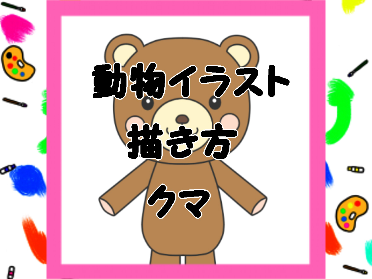
Search queries for simple bear sketches, historically captured in Japanese and East Asian query streams as "熊 の イラスト 簡単", have surged into an international illustration movement. Walk through Seoul's design districts of Yeonnam-dong or Seongsu-dong, and the motif is everywhere: on oat-milk latte sleeves, textured phone cases, linen tote bags, and frosted glass tumblers. By early 2026, this understated visual language had migrated directly into digital planners, GoodNotes templates, and social feeds across North America and Europe, transforming how hobbyists approach everyday art.
The aesthetic rejects anatomical complexity in favor of soft geometry, muted palettes, and intentionally relaxed line work. What looks at first glance like an effortless 15-second scrawl is actually a calculated design discipline. Driven by the viral popularity of Korean indie stationery brands and the widespread adoption of iPad drawing apps, the cafe-style bear doodle has established itself as the defining entry point for beginner digital sketching.
📌 Key Takeaways:
- The Viral Origin: Independent stationery studios in South Korea sparked the aesthetic, transforming casual cafe journaling into a global digital planning trend.
- The Structural Formula: Achieving the look relies on dropping facial features into the lower third of the head, paired with uniform line weight and softened geometric silhouettes.
- Production Shift: Digital creators have replaced complex shading with flat, desaturated pastel palettes and monoline brush tools calibrated for minimal pressure dynamics.
From Seoul Alleyways to Global Feeds: The Rise of Cafe Doodling
The visual roots of this phenomenon trace back to South Korea's independent design studios between 2021 and 2024. Labels like Dinotaeng, Romane, and Second Morning proved that hyper-simplified mascot characters could power lucrative consumer brands. Rather than pursuing the glossy, high-energy finish typical of legacy mascot design, these studios embraced the texture of everyday paper goods: cream-colored backgrounds, imperfect graphite edges, and quiet, domestic scenes. Characters were often depicted holding warm mugs, balancing pastries, or simply staring forward with wide-set eyes.
Social media algorithms quickly accelerated this transition. Short-form drawing tutorials on platforms like Instagram Reels and TikTok stripped the intimidation out of creative practice. Instead of demanding years of anatomical study, these tutorials promised viewers that three overlapping curved strokes could produce a lovable character. By early 2025, digital planners on Etsy and stationery shops across North America saw an influx of custom brush packs and digital sticker kits modeled entirely on this cozy, slow-paced aesthetic.
Decoding the Charm: Line Economy and Teddy Bear Facial Proportions
The defining trait of the Korean cafe doodle aesthetic is radical visual economy. In standard kawaii animal illustration, artists often rely on oversized, glossy eyes with intricate highlights to force an emotional connection. The cafe doodle does the opposite. Eyes are rendered as tiny, solid black dots or short vertical ticks, stripped of reflection or secondary glare.
The secret lies in facial proportions. In typical human-like illustration, eyes sit near the vertical midpoint of the skull. In cafe bear sketches, the eyes, nose, and mouth drop into the bottom 25% to 30% of the head boundary. Spacing the eyes wide apart and placing a small oval snout directly between them instantly triggers what evolutionary biologists call *kindchenschema*, the baby schema that prompts tenderness and warmth. Keeping the ears slightly irregular and flattened against the head reinforces an unpretentious, handmade feel, avoiding the sterile precision of corporate vector icons.
The Evolution of Digital Stationery Aesthetics (2023, 2026)
The technical approach to cute stationery illustration has shifted dramatically over recent product cycles, moving from colorful vector assets to tactile, digital-analog hybrid sketches.
| Period | Dominant Tooling | Line Work Style | Palette Profile |
|---|---|---|---|
| 2023 | Vector apps (Illustrator, Vectornator) | Tapered calligraphic lines, high smoothing | Saturated pastels (bubblegum pink, mint) |
| 2024, 2025 | Procreate, GoodNotes native pens | Variable-width chalk and rough dry ink | Earthy neutrals (kraft brown, warm beige) |
| 2026 | Procreate monoline, Clip Studio, Penup | Fixed-width monoline, softened organic wobble | Desaturated milky tones (biscuit, butter, sage) |
The Digital Workspace: Monoline Brushes and Muted Tones
Achieving this look on a tablet requires specific configuration. Many beginners run into trouble by using standard pressure-sensitive brushes that mimic fountain pens. Tapered lines introduce dynamic tension, which clashes with the relaxed, unhurried energy of cafe doodles.
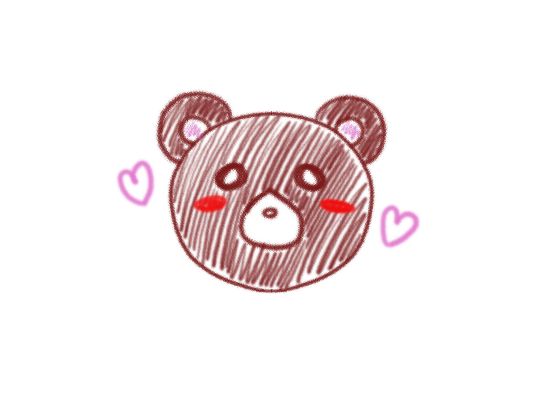
Most community artists rely on a Procreate monoline brush adjusted to remove pressure dynamics entirely. When line thickness remains identical throughout the stroke, the illustration takes on the character of a fine felt-tip pen on rough paper. Digital creators often set brush stabilization (streamline) to roughly 20%, 35%, enough to smooth out unwanted hand tremors while preserving the slight, charming imperfections of manual line work.
Color selection reinforces this mood. The reigning pastel color palette avoids pure black outlines. Creators swap stark `#000000` linework for deep espresso (`#3D2E24`), soft charcoal (`#4A4A4A`), or warm bark (`#5C4033`). Fill tones avoid high-chroma primaries in favor of dairy-inspired washes: whipped butter (`#FFF4D2`), toasted biscuit (`#D8C2A7`), and warm oat milk (`#F5EBE1`). Placing these shades against a faintly textured, off-white background produces the comforting feel of an afternoon journal session.
Step-by-Step Construction for Planners and Stickers
The construction workflow prioritizes quick, reproducible silhouettes over elaborate under-drawings. Whether working in an analog sketchbook or creating digital assets for a journal, the sequence follows five clean stages:
Start with a softened square or squat oval for the head. Avoid sharp corners; round the edges generously so the skull mimics a soft bread roll. Add two small semi-circles on the upper corners for ears. Place them slightly outward rather than directly on top to enhance the squat, relaxed profile.
Next, establish the focal center. Draw an ivory or cream oval horizontally across the lower third of the face to serve as the snout. Inside this zone, place a wide triangular nose with rounded corners, followed by a simple inverted "T" or "W" shape for the mouth. Place two pinpoint eyes just outside the boundary of the snout oval, keeping them horizontally aligned with the nose.
Keep the body simple. A rounded bell shape extending downward from the chin creates an immediate sitting posture. Add two tiny, curved nubs for paws resting over the tummy. For those designing physical items like a hand-drawn sticker design, finish the piece by adding a uniform white offset border around the exterior line, giving the digital sketch the tactile appeal of a vinyl cutout.
Micro-Stationery and the Economics of Low-Fidelity Art
The explosion of minimal bear illustrations has created real commercial momentum for independent illustrators. On platforms like Etsy, Gumroad, and Booth, digital sticker sheets and GoodNotes planner inserts generated around simple animal doodles maintain remarkably strong margins. Because production demands are low, requiring neither complex 3D rendering pipelines nor weeks of painterly rendering, illustrators can release fresh seasonal packs weekly.
Merchandise runs follow a similar pattern. Print-on-demand services allow creators to translate a 20-minute Procreate sketch into thermal water bottles, die-cut vinyl stickers, and embroidered canvas pouches with minimal upfront inventory costs. The low-fidelity aesthetic works to the artist's advantage: consumers actively seek out items that feel informal, personal, and human, viewing hyper-detailed digital art as impersonal or corporate.
Frequently Asked Questions (FAQ)
Q1: Why do my minimal bear drawings look stiff instead of cute?
A1: Stiffness usually comes from two things: placing the facial features too high and making the shapes too symmetrical. Lower the eyes and snout into the bottom third of the face, and allow slight hand variations in the ear shapes. Perfect circles look robotic; gently flattened, organic curves look friendly.
Q2: What is the best brush setting for beginner digital sketching on an iPad?
A2: Use a default Monoline brush with pressure sensitivity turned completely off. Set Streamline or brush stabilization between 25% and 35%. This prevents jittery strokes without snapping your lines into rigid, unnatural computer vectors.
Q3: Can this style work on traditional paper without digital tools?
A3: Yes. Use a water-resistant 0.5mm or 0.8mm pigment fineliner with a consistent line weight, paired with dual-tip alcohol markers in pale, warm tones like beige, sand, and pale blush. Avoid pure white sketch paper; cream or kraft paper produces an authentic cafe-doodle look instantly.
The Enduring Appeal of Purposeful Simplicity
The popularity of easy bear doodles highlights a broader creative reset. In an illustration climate crowded with hyper-rendered compositions and complex software toolchains, the Korean cafe doodle offers an inviting alternative. Its appeal lies in deliberate restraint: knowing that a handful of well-proportioned lines, a warm palette, and an open layout can deliver just as much personality as an elaborate canvas.
For casual journalers and commercial designers alike, the minimalist bear is more than a fleeting internet fad. It serves as a practical blueprint for visual storytelling. By stripping away decorative clutter, this humble sketching style proves that quiet simplicity often leaves the warmest impression.