Eikichi Yazawa Logo Font FAQ: Design Origins, Typography Dupes, and Licensing Rules

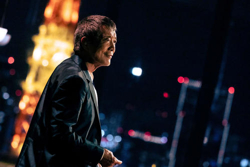
When 76-year-old rock icon Eikichi Yazawa made his surprise appearance at the 76th NHK Kohaku Uta Gassen on December 31, 2025, the performance did not simply ignite television ratings; it beamed his singular monogram into living rooms nationwide. High above NHK Hall, the illuminated "E.YAZAWA" insignia flashed before the singer stepped out in his trademark dark sunglasses. Fans recognized the jagged, high-voltage letters instantly. Weeks later, anticipation surged again ahead of the January 28, 2026, limited vinyl edition of his 35th studio album I believe, his first record in six years. According to a 山陽新聞 Report, the package included a special 50th-anniversary bumper sticker bearing the exact letterforms that have dominated Japanese stadium culture for five decades.
For graphic designers, typographers, and music historians, the recurring question remains: what font is the Eikichi Yazawa logo, and how can digital creators reproduce its raw weight? The short answer disrupts casual font hunters using automated tools like WhatTheFont: the emblem is not an off-the-shelf digital font. It is a work of bespoke hand-lettering crafted in the analog era, surviving unaltered through strict trademark stewardship.
📌 Key Takeaways:
- The Typography Reality: The official E.YAZAWA logotype is custom rock star lettering drawn in the late 1970s, not an existing commercial font family.
- The Best Digital Dupes: Designers seeking equivalent visual weight rely on heavily modified cuts of Friz Quadrata, Albertus, and ITC Serif Gothic.
- Legal Boundaries: Management firm Z+ vigorously polices unlicensed vector emblem recreation, vehicle decals, and custom apparel under Japanese trademark statutes.
The Secret Behind Japanese Classic Rock Branding
The mid-1970s marked a radical turning point for domestic music packaging in Japan. Following the bitter breakup of his pioneering group Carol in 1975, Yazawa realized that artistic independence required total control over visual presentation. Western imports like Kiss, Aerosmith, and Led Zeppelin brought heavily stylized, architectural wordmarks to Tokyo record stores. Japanese artists, by contrast, frequently relied on plain typesetting chosen by record company art directors.
Yazawa broke that template. Working alongside visual designers during his early solo releases under CBS/Sony, his team drafted a custom mark built on aggressive, angled serifs and razor-sharp terminals. The punctuation dot tucked tightly between the initial "E" and the surname "YAZAWA" gave the identity an Anglo-American swagger while maintaining unmatched readability from the back rows of Budokan.
Unlike contemporary digital branding that prioritizes responsive mobile screens, this visual identity came of age on physical textures. It was drawn specifically to be silkscreened onto oversized beach towels, stenciled onto flight cases, and stamped across double-gatefold vinyl jackets.
Inside the Letterforms: Serifs, Proportions, and the Punctuation Dot
Analyzing the vector paths of the modern logo reveals distinct physical characteristics that prevent digital font identifiers from spitting out an exact match.
First, look at the capital E. The central crossbar sits slightly higher than mathematical center, lending the letter an upright, chest-out posture. Both upper and lower horizontal arms terminate in wedge serifs that bite outward at approximately 45-degree angles.
Next comes the centered period. It does not rest on the baseline like standard punctuation in Adobe InDesign. Instead, it hovers at mid-height, maintaining visual momentum between the solo letter and the family name.
The surname YAZAWA carries the real rhythmic power:
- The Y features broad angled arms that drop into a short, stocky vertical stem, keeping the letter's center of gravity remarkably low.
- The three As act as visual anchors. Rather than standard triangular apexes, they display slight horizontal flat tops with flared, muscular bases that prevent the wordmark from looking top-heavy.
- The central Z functions as the design’s engine. Its diagonal stroke cuts across the baseline with heavier stroke contrast than traditional Roman typefaces, echoing mid-century automotive chrome scripts.
- The final W utilizes overlapping inner diagonals, a hallmark of mid-20th-century display lettercraft.
Every stroke carries calculated contrast. Vertical stems remain thick, horizontal connections pinch down, and corners finish with deliberate geometric cuts.
The Closest Typeface Matches and Commercial Font Dupes
Typographers tasked with creating homage posters or editorial layouts capturing this aesthetic cannot simply install a licensed Yazawa file. You must start with historical display faces and modify their outlines manually.
| Typeface Name | Classification | Visual Match Rating | Required Modifications |
|---|---|---|---|
| Friz Quadrata Bold | Flared Display Serif | 88% | Widen the Z diagonal; sharpen terminal points; tighten tracking by -30. |
| Albertus Bold | Incised / Chiseled Serif | 78% | Increase vertical stem thickness; add flared tips to horizontal strokes. |
| ITC Serif Gothic Black | Hybrid Display | 72% | Extend triangular serif points; widen the stance of letters A and W. |
| Copperplate Gothic Heavy | Monoline Small Serif | 65% | Heavy stroke contrast additions needed; convert to title-case proportions. |
For body text and supporting titles in rock-themed editorial layouts, commercial font pairing alternatives should avoid delicate romantic serifs. Instead, pair these modified display headlines with sharp geometric sans serifs like Futura Bold, or stout workhorse typefaces like Antique Olive and Compacta.
From Stadium Towels to Highway Rear Windows
The durability of this typography owes much to the physical rituals of the singer's passionate fan base. During stadium renditions of anthems like "Ha-Ha," thousands of concertgoers throw their Special Beach Towels (SBT) into the air simultaneously. The towel features the wide, blocky logo stretched across high-pile jacquard cotton. Thin, delicate letterforms would dissolve into cotton thread loops. Yazawa’s chunky, chiseled stems were engineered to survive weaving mills without bleeding into legibility issues.
That same legibility fueled a distinct automotive subculture across Japan. From customized Toyota HiAce vans to pristine black Celsior sedans, fans display high-gloss vinyl transfer decals across their rear windshields. The horizontal spread of "E.YAZAWA" fits standard automotive glass lines with surgical precision.
When Yazawa’s 50th solo debut commemorative edition dropped in early 2026, the inclusion of the retro-tinted bumper sticker highlighted how conscious his design team remains of this roadway presence. For car owners, the lettering serves as a subcultural badge, signaling unvarnished loyalty to working-class rock values.
Vector Emblem Copyright Rules and Trademark Enforcement
Because the logo looks straightforward, amateur designers frequently convert raster concert photos into vector paths using Illustrator, selling DIY cutting decals on flea market apps. Doing so crosses serious legal lines.
Yazawa's management office, operating through Z+ (formerly Garuru Records and associated corporate entities), holds airtight trademark registrations covering Classes 9, 16, 25, and 41 under the Japan Patent Office (JPO). These classes protect the exact stylized lettering across:
- Sound recordings and digital media
- Printed matter, bumper stickers, and vector emblems
- Clothing, hats, and the iconic concert towels
- Live entertainment and merchandising productions
Japanese intellectual property courts draw sharp lines between private fan enjoyment and public trademark infringement. Cutting a vinyl decal on a Silhouette or Cricut plotter for your own living room shelf rarely attracts corporate legal teams. The moment an unauthorized decal appears for sale on Mercari, Yahoo! Auctions, or Rakuten, Z+ legal representatives routinely dispatch statutory takedown notices.
Vector tracing does not bypass trademark rules. Even if a fan creates their own SVG path from scratch without copying an official digital file directly, the commercial use of confusingly similar lettering for rock goods violates unfair competition prevention laws.
Frequently Asked Questions (FAQ)
Q1: What is the official digital font used for the Eikichi Yazawa logo?
A1: There is no commercial digital font. The mark is a proprietary, custom-lettered logotype created specifically for Yazawa’s solo career branding in the late 1970s.
Q2: What is the best commercial typeface to recreate the Yazawa aesthetic legally?
A2: Friz Quadrata Bold provides the most accurate starting point due to its flared serifs and heavy presence. Designers manually widen the horizontal proportions and sharpen the serifs in vector editing software to match the 1970s rock aesthetic.
Q3: Can I cut my own E.YAZAWA car sticker using a vector vinyl plotter?
A3: Under Japanese and international copyright doctrines, personal non-commercial crafting stays within fair use gray areas. However, distributing, selling, or using those decals for corporate promotion violates Z+'s registered trademark rights.
Q4: Why does the logo feature a dot after the letter E?
A4: The middle-aligned dot balances the visual spacing between the single initial "E" (for Eikichi) and the wide surname "YAZAWA," creating a unified horizontal badge rather than two disconnected text elements.
The Enduring Power of a Rock Monolith
In an era when modern brands frequently flatten their identities into interchangeable neo-grotesque sans serifs, the E.YAZAWA identity remains proudly unapologetic. It carries the soot, chrome, and high-decibel swagger of 1970s stadium rock. Fifty years into his solo journey, Yazawa’s name continues to fill concert halls and dominate vinyl pressings. The design works because it refuses to conform to passing graphic design fads, standing as a masterclass in custom visual identity that outlives every digital font trend.