Why Dark-Cute Anime Girl Art Is Exploding Worldwide Right Now
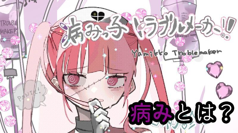
A porcelain anime face with swollen, pink-rimmed eyes, jet-black hime-cut bangs, a pastel medical eyepatch, and razor-sharp silver rings: this striking visual silhouette now floods international feed algorithms. Illustrations of the dark-cute girl, known across Japanese online subcultures as yami kawaii and jirai-kei art, have decisively breached overseas creative spaces. What began as an insular Tokyo youth aesthetic has grown into an international illustration movement, sparking passionate debates over whether dressing emotional distress in candy-floss hues represents radical empathy or commercial trivialization. A recent [ファミ通 Report](https://www.famitsu.com/article/202602/65949) highlighting critic Toru Kanezaki’s award-winning analysis of the video game Yamikko Trouble Maker framed the central tension directly: when psychological darkness turns casual and pink, where does visual catharsis end and commodification begin?
📌 Key Takeaways:
- Subcultural Roots: Dark-cute illustration emerged from Harajuku counterculture, weaponizing medical imagery, pastel pinks, and gothic blacks to reject the demand for sanitised cheerfulness.
- Cross-Border Expansion: Visual motifs have spread rapidly from Tokyo to platforms like China's RED (Xiaohongshu) and Western design boards, driving commercial partnerships for brands like WEGO.
- Celebrity Validation: Cultural icons like singer-actress Ano-chan have brought the aesthetic to mainstream television, anchoring a specific look defined by sharp eyeliner, dark bobs, and doll-like melancholy.
Harajuku’s Rebellion Against Sanitized Kawaii
Traditional kawaii culture demanded relentless optimism. For decades, the global brand of Tokyo street style relied on sugar-sweet pastels, childlike accessories, and frictionless innocence. In the mid-2010s, an underground countercurrent formed around the Takeshita Street back-alleys and private online community boards. Illustrators began drawing characters that paired Sanrio-grade softness with symbols of acute mental distress: surgical masks, blister packs of tranquilizers, dripping bandages, and hollow-eyed stares.
This faction splintered into menhera art (derived from "mental health-er") and yami kawaii ("sick-cute"). The visual language offered an outlet for young Japanese artists grappling with rigid social expectations, academic anxiety, and lingering taboos surrounding psychiatric care. Instead of hiding vulnerability, artists displayed it on the canvas with bright neon hearts and dripping IV drips. The dark-cute girl illustration became an avatar for feelings that society insisted should remain behind closed doors.
By blending cuteness with pain, creators created an aesthetic armor. The characters look vulnerable, but their exaggerated visual styling projects clear defiance. Viewers connect with the work because it does not demand emotional perfection.
The Visual Anatomy of Pastel and Black Contrast
The design architecture of modern dark-cute character illustration relies on deliberate visual friction. Artists juxtapose extreme visual softness with severe, menacing accents. Character designers construct these portraits through four distinct technical pillars:
First, the color palette builds tension between baby pinks, lavenders, and obsidian blacks. Backgrounds and hair shades often employ creamy, desaturated pastels, which are then pierced by high-contrast black chokers, leather harnesses, and heavy platform boots. This chromatic push-pull mirrors the emotional tone of the character: delicate on the exterior, turbulent beneath.
Second, facial geometry focuses intensely on the eye area. Illustrators use heavy reddish-pink shading under the lower eyelid to mimic the puffiness of recent tears, often pairing it with enlarged aegyo-sal (under-eye skin bags) and pin-prick pupils. The mouth is rendered small, neutral, or slightly downturned, eliminating the wide, eager smiles common in standard idol artwork.
Third, medical and gothic accessories act as emotional signifiers. Band-aids, safety pins, spiked collars, and oversized hoodies communicate self-isolation and physical vulnerability. The clothing frequently swallows the character's hands in drooped sleeves, suggesting a desire to retreat from external pressure.
From Underground Zines to Mass Aesthetic: A Decade of Shifts
The transformation of dark-cute character art from rebellious subculture to global commercial titan did not happen overnight. Tracking this trajectory reveals how digital platforms flattened geographic boundaries and normalized countercultural imagery.
| Aesthetic Phase | Defining Visual Motifs | Primary Medium | Cultural Reach |
|---|---|---|---|
| Menhera & Early Yami Kawaii (2014, 2018) | Pastel syringes, hospital drips, gauze patches, light mint and pink. | pixiv sketches, independent zines, indie Harajuku apparel brands. | Niche Tokyo youth culture and alternative fashion circles. |
| Jirai-Kei Consolidation (2019, 2023) | Frilled black blouses, twin tails, red eye makeup, MCM backpacks, Kuromi iconography. | X (Twitter), TikTok fashion reels, line sticker packs, VTuber models. | Domestic mainstream Japanese youth culture and East Asian fashion hubs. |
| Global Digital Mainstream (2024, 2026) | Trauma-core character design, luxury gothic streetwear, stylized digital concept art. | RED (Xiaohongshu), international webtoons, indie games, TV branding. | Worldwide animation, fast-fashion retail partnerships, gaming IPs. |
The Ano-chan Effect and Mainstream Screen Culture
No real-world figure illustrates the normalization of this visual aesthetic better than the multi-hyphenate artist Ano-chan. Emerging from alternative idol group You'll Melt More!, Ano built an unmistakable persona defined by an asymmetrical bob, doll-like speech cadence, sharp eyeliner, and unapologetic weirdness. Her face and silhouette became an immediate template for digital illustrators worldwide.
In mid-2026, physiognomy analyst Eichi Ikebukuro highlighted the mechanics of the "Ano-chan line", the signature combination of straight eyeliner wings, bright lower-lid highlights, and a detached gaze, as the visual archetype of modern dark-cute character rendering. Her transition from fringe counterculture to premier media figure crystallized when she secured the lead role in the TV Tokyo late-night drama Watashi no Sōsai Nikki, produced by the creative team behind Kodoku no Gourmet. The casting confirmed that the gloomy, fragile persona that once alienated mainstream producers now anchors network programming.
Digital artists study her proportions directly. Fan art and original characters adopt her high-contrast fringe, heavy silver jewelry, and trademark oversized sportswear. The boundary between living subcultural icons and illustrated characters has effectively dissolved.
The Jirai-Kei Export: Crossing into International Feeds
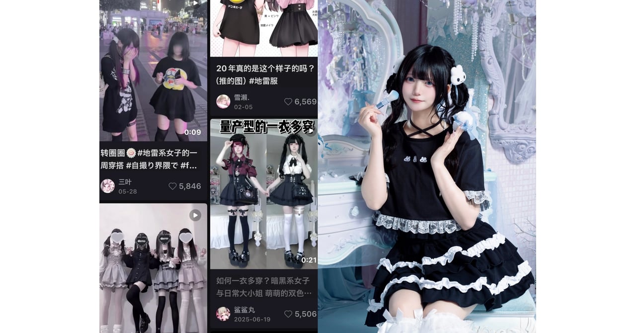
The international spread of dark-cute girl illustration owes much of its velocity to jirai-kei ("landmine-type"), an offshoot aesthetic that blends gothic Victorian silhouettes with yami-kawaii makeup. While the term originally carried derogatory connotations, warning men of emotional volatility, young women reclaimed the visual codes as an unapologetic badge of identity.
Reporting from Fashionsnap showed that jirai-kei aesthetics crossed borders at scale, achieving massive engagement across China on lifestyle platforms like RED (Xiaohongshu). Searches for jirai-kei girl portraits, makeup tutorials, and illustrated avatars generated hundreds of millions of views. Major Japanese retailers moved quickly to capitalize on this cross-border boom. Brands like WEGO launched international visual campaigns featuring character collaborations such as "Yasausa-chan," pairing oversized dark-pink graphics with street-ready goth-pop silhouettes.
Online character artists worldwide adopted these visual codes because they read cleanly on mobile screens. The distinct silhouette, dark ribbons, high-volume twin tails, and oversized collars, remains recognizable even at thumbnail resolutions. Freelance illustrators on platforms like ArtStation and Cara report surging client commissions for game avatars, streaming overlays, and merchandise designs based explicitly on jirai-kei visual conventions.
Commercial Polish Versus Authentic Emotional Pain
The rapid globalization of dark-cute art brings uneasy creative compromises. When Toru Kanezaki analyzed Yamikko Trouble Maker for Famitsu, his core critique hit a sensitive cultural nerve: has making darkness fashionable stripped away the genuine vulnerability that gave the genre its power?
Early menhera artists worked from raw experience, illustrating isolation and anxiety as personal survival mechanisms. Fast-forward to 2026, and the aesthetic operates as a repeatable, profitable design template. Independent fashion houses, high-street apparel chains, and corporate mobile games can deploy pastel bandages and weeping anime eyes as superficial styling, completely disconnected from mental health discussions.
Community sentiment on digital art forums reflects this split. Many veteran creators argue that corporate packaging reduces painful emotions to hollow visual trends. Conversely, younger digital illustrators maintain that stylized melancholy gives everyday loneliness a wearable, approachable form. For an audience facing post-pandemic isolation, economic instability, and relentless performance pressures online, drawing a girl who looks exhausted yet impeccably stylish remains an honest self-portrait.
Frequently Asked Questions (FAQ)
Q1: What is the primary artistic difference between yami kawaii and jirai-kei illustrations?
A1: Yami kawaii focuses heavily on pastel colors, medical paraphernalia (syringes, band-aids, pills), and overt hospital motifs. Jirai-kei leans into Victorian gothic fashion, pairing ruffled black blouses, frilled skirts, heavy silver accessories, and teardrop-accented makeup.
Q2: Why do dark-cute illustrations emphasize red under-eye makeup?
A2: The technique mimics the natural redness and swelling caused by crying, creating an immediate visual cue of emotional vulnerability. It originated in Japanese subcultural makeup trends and was adapted by illustrators to give characters a delicate, emotionally raw appearance.
Q3: Is the dark-cute girl aesthetic considered offensive or stigmatizing in Japan?
A3: Perceptions vary. The related label menhera was once used dismissively toward individuals with mental health issues. Subcultural artists and young women actively reclaimed these symbols to validate emotional struggles, though mainstream cultural critics still debate whether commercializing the look trivializes real mental health challenges.
The Enduring Pull of Flawed Character Design
Dark-cute anime girl illustration shows no sign of fading back into underground obscurity. Its durability stems from a simple artistic reality: audiences are exhausted by idealized perfection. The pristine, smiling heroines of conventional corporate animation feel increasingly distant from modern life.
By contrasting soft pinks with harsh gothic accents, illustrators give visual form to complex inner lives. The dark-cute girl wears her flaws on her sleeve, combining sadness, anger, and sweetness into a single visual statement. As artists around the world continue refining this visual language across webcomics, concept art, and indie games, the aesthetic stands as one of the most honest creative trends to emerge from Japanese pop culture this decade.